Uncrossed
Game UX/UI Redesign
[vc_row css=”.vc_custom_1568265510352{padding-top: 50px !important;}”][vc_column]
The 90 Minute Makeover
[/vc_column][/vc_row][vc_row][vc_column][vc_column_text]This project was a quick revision of a game my developer friend created for his company Styrogome Games. After he launched the beta version of his game, I stepped in to help with the overall UX/UI of the game.[/vc_column_text][/vc_column][/vc_row][vc_row][vc_column]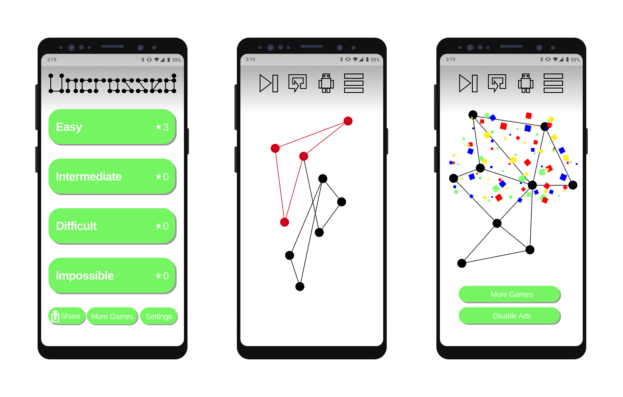 [/vc_column][/vc_row][vc_row][vc_column]
Original App Issues
[/vc_column][/vc_row][vc_row][vc_column width=”1/2″][vc_column_text]
- The game logo is difficult to read, especially from a branding perspective.
- There is no information on how to play the game or know your score.
- The interface is very button-heavy.
[/vc_column_text][/vc_column][vc_column width=”1/2″][vc_column_text]
- The icons are clunky and take a moment to understand.
- The colors are drawn from stock swatch colors.
- Boy, that lime green really sears the corneas!
[/vc_column_text][/vc_column][/vc_row][vc_row][vc_column]
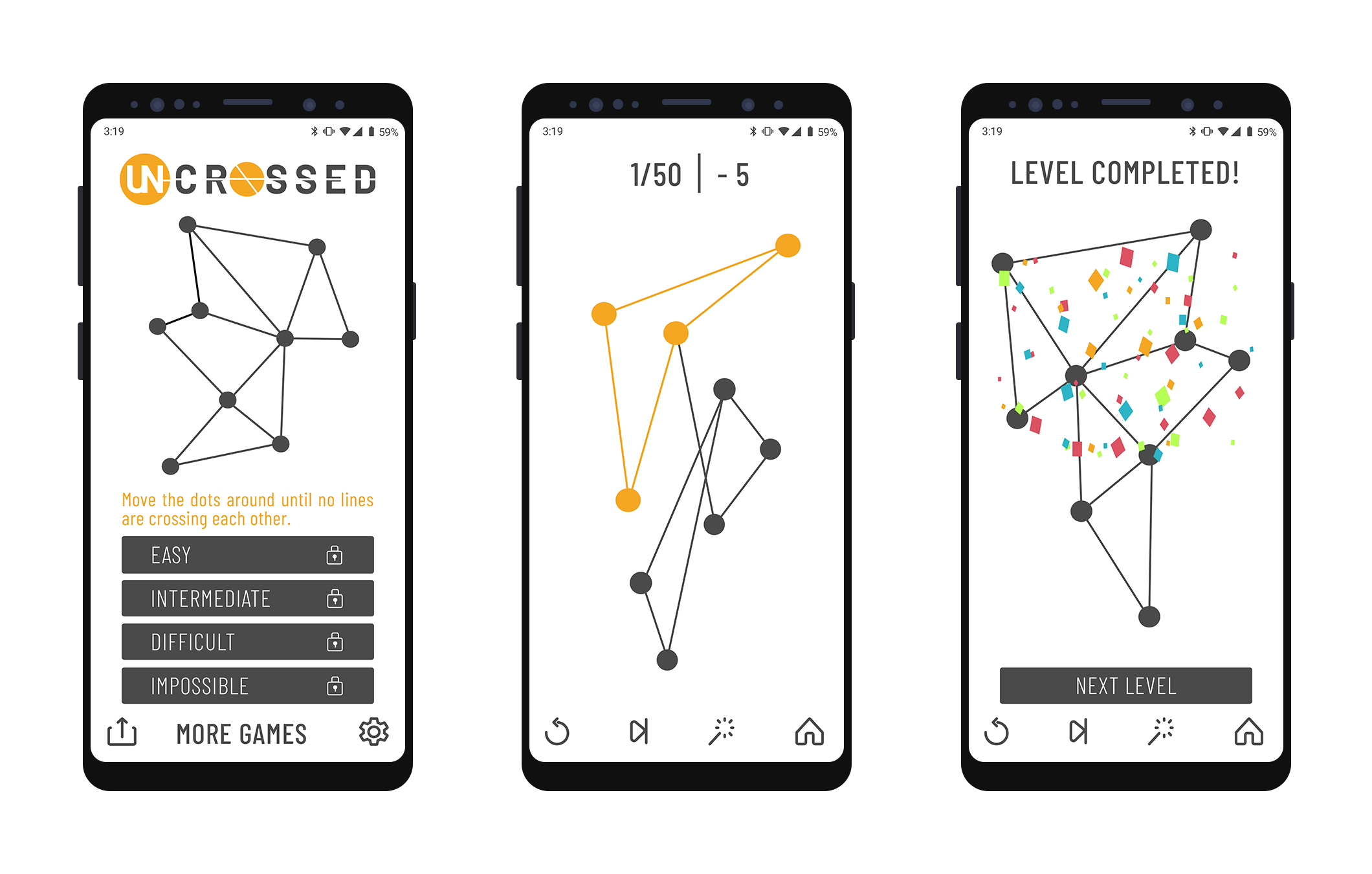
Keeping Things Clean
[vc_column_text]
- Redesigned the logo to be more legible while suggesting the nature of the gameplay.
- Due to the game’s simple gameplay, a more minimal interface and subdued color palate were chosen so a player could focus on the complexity of the puzzle.
- Menu buttons are smaller so the launch page can include game instructions and an example of a completed puzzle.
- A scoreboard was added so that a person knows how far along they are in each section.
- Simpler more universally intuitive icons were used and relocated to the bottom of the interface to keep the screen from looking top heavy
[/vc_column_text][/vc_column][/vc_row][vc_row][vc_column]
The Redesign – White Version
 [/vc_column][/vc_row][vc_row][vc_column]
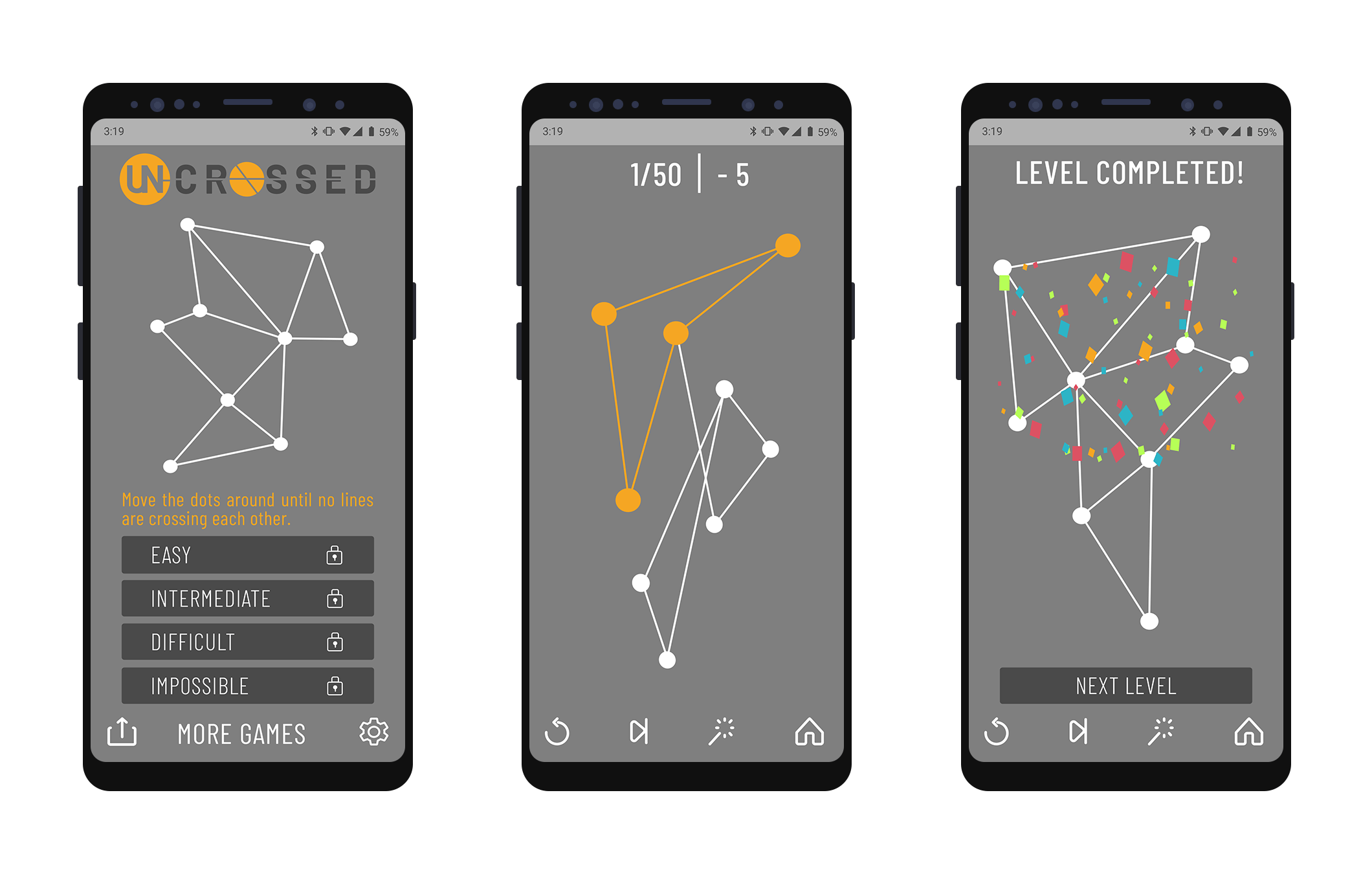
The Redesign – Gray Version
 [/vc_column][/vc_row]