
Mark Bittman’s How To Cook Everything App – UX Design Refresh
The Kitchen Audit: Modernizing a Culinary Classic
The Legacy In 2014, legendary food columnist Mark Bittman translated his “culinary bible,” How to Cook Everything, into a digital companion. At the time, it was a game-changer—bringing 20 cookbooks’ worth of expertise into the palm of a user’s hand.
The Decay Fast forward to today, and the “Kitchen MVP” is showing its age. Since its last update in 2017, the app has become a digital relic in a rapidly evolving market.
-
The UX Gap: Compared to today’s sleek, gesture-based interfaces, the Bittman app feels like a clunky PDF.
-
The Opportunity: While the content remains gold, the delivery is broken. The app is a treasure trove trapped in an outdated vault, desperately needing a “visual and functional garnish” to compete with the new wave of culinary tech.
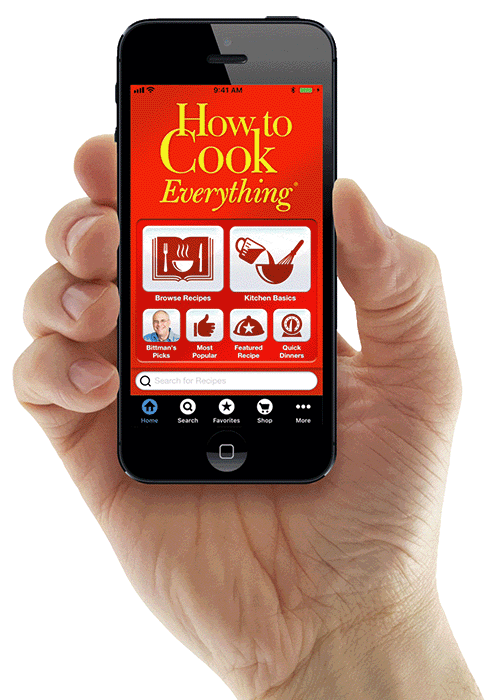
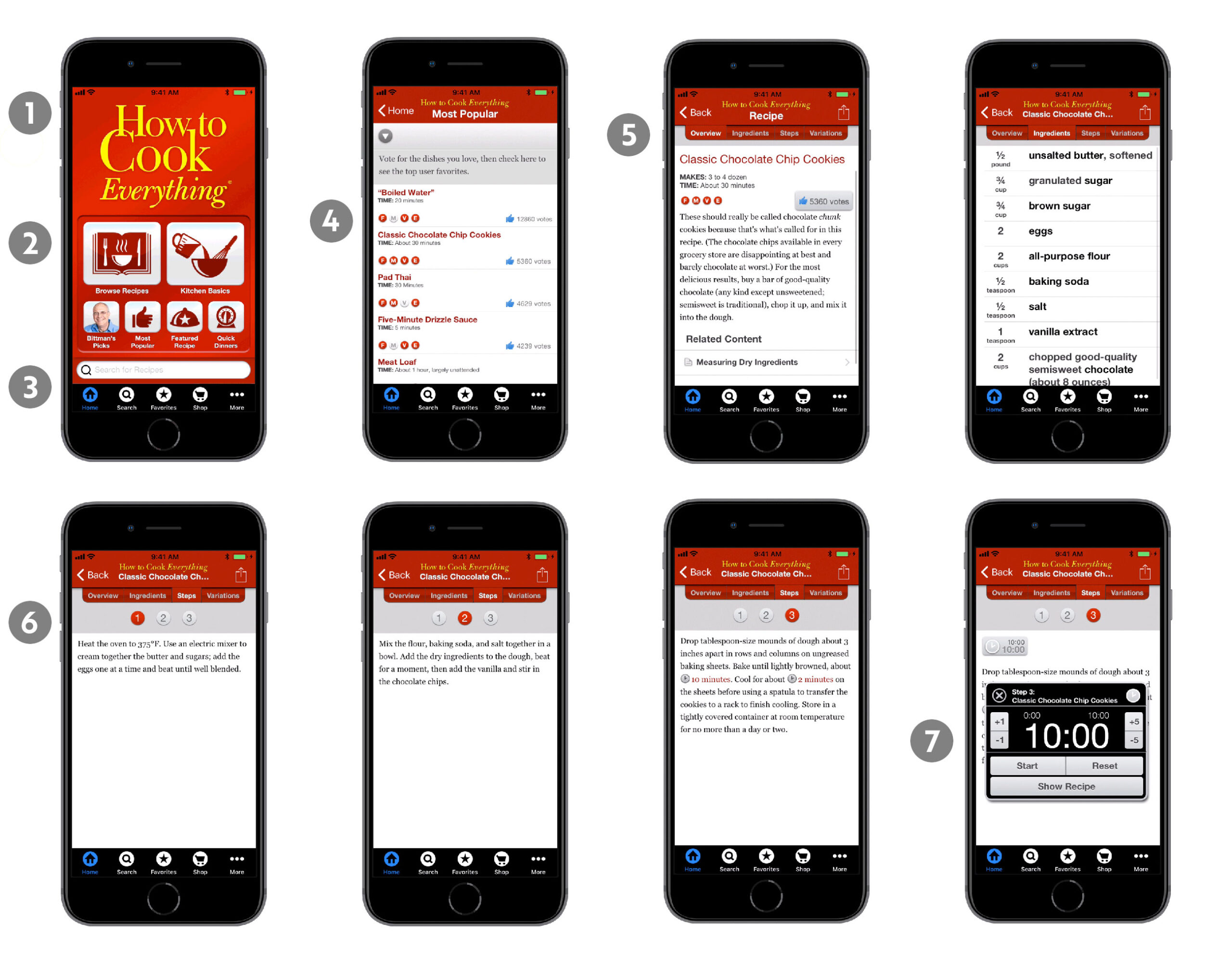
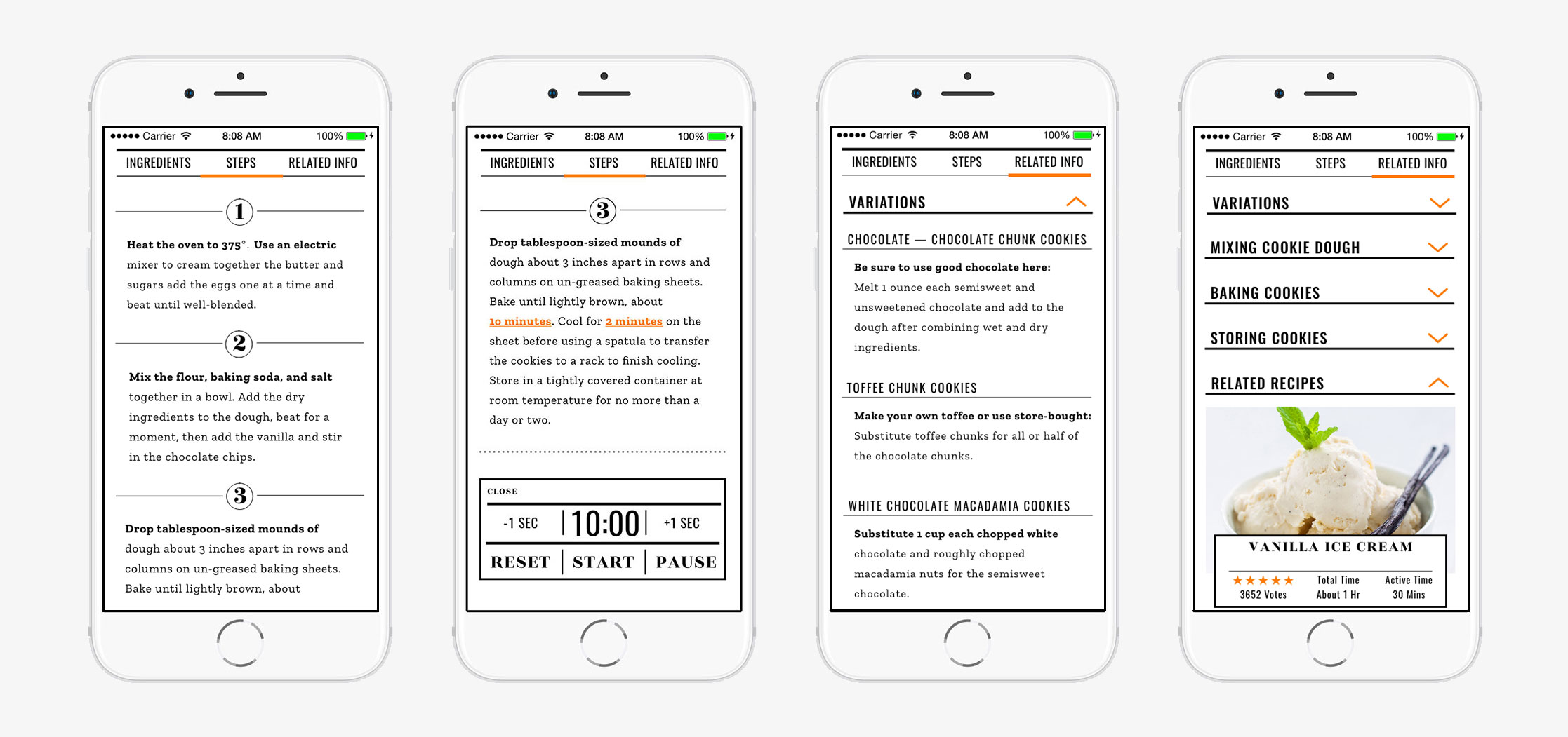
The Original App Interface
The Kitchen Post-Mortem: Why the Original App Stalled
Before I could rebuild, I had to deconstruct. The original interface felt less like a modern tool and more like a digital junk drawer. Here is where the user experience broke down:
-
Visual Fossilization: The UI felt stuck in the early 2010s—dated, clinical, and frustratingly non-intuitive for the modern mobile user.
-
Category Overload: The main menu suffered from “Analysis Paralysis,” buried under a mountain of options that made a simple search feel like a chore.
-
Search Chaos: Dueling search bars on the home screen created unnecessary visual clutter and left users wondering which one actually worked.
-
The Alphabet Soup: Recipes were cluttered with cryptic, single-letter icons. Without a legend, users had to guess whether “S” meant “Saute,” “Slow Cook,” or “Spicy.”
-
The “Textbook” Trap: By relying on dense paragraphs and the occasional dry sketch, the app stripped the joy out of cooking, making every dish feel academic and generic.
-
The “Invisible” Meal: With a total absence of photography, users were expected to cook “blind.” Without a visual goal, the recipes lacked appetite appeal and credibility.
-
The Clunky Countdown: The pop-up timer was a workflow killer. Forcing users to tap 1- or 5-minute increments made setting a 45-minute roast feel like a thumb workout.
The Redesign: Food for the Eyes
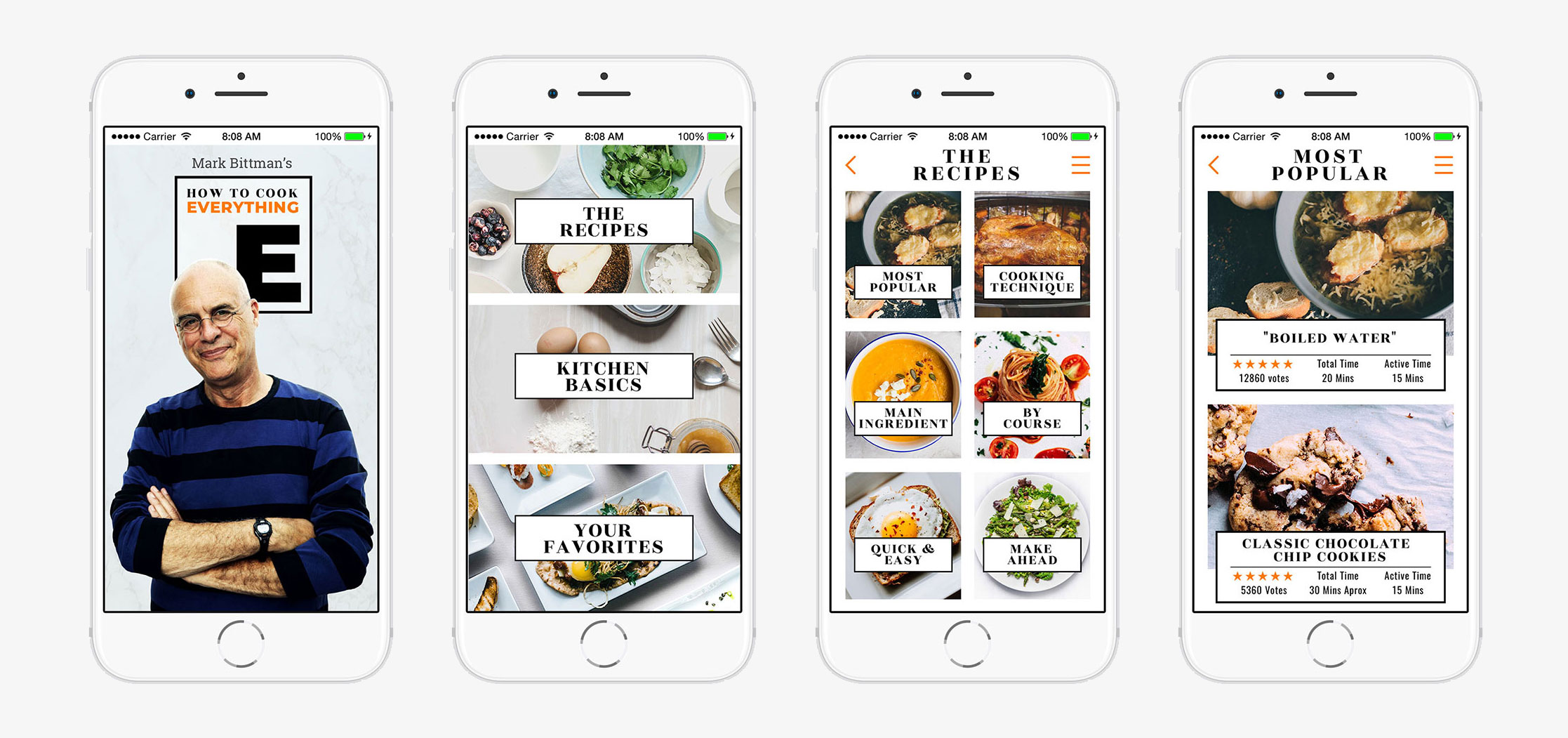
The Appetite for Change A great cooking app shouldn’t just be a manual; it should be an invitation. It should make you hungry, entice you to explore, and tempt you to ruin a clean apron. I set out to transform a “database of text” into a vibrant culinary playground.
The Sensory Overhaul I kept the foundational DNA of the original app but stripped away the clinical, outdated UI in favor of a visual-first philosophy. Cinematic Focus: In the new interface, the meal is the star. I utilized high-resolution, full-bleed photography to make every recipe the primary focus, letting the food do the talking.
-
Intuitive Architecture: While all the original menu topics remain, they are now mapped into a seamless, “scroll-worthy” flow.
-
A Modern Palette: I reworked the typography and color theory to be clean and minimal, ensuring that the interface provides visual breathing room rather than cognitive clutter.
The result is a more robust, informative experience that feels less like a textbook and more like a high-end food magazine—designed to take a user from “What’s for dinner?” to “I need to make this right now.”
The “Smart” Kitchen: Interactive Cooking
The content isn’t just displayed—it’s engineered for action. I moved beyond the static page to create a dynamic environment where every element is an interactive tool.
-
Dynamic Scaling: Whether you’re cooking for a solo weeknight or a dinner party of twelve, the app does the math for you. One tap scales every ingredient instantly—no more “kitchen math” mishaps.
-
Ingredient Intelligence: Curious about a specific spice or cut of meat? Every ingredient photo is a clickable portal, providing instant education on flavor profiles, selection tips, and prep techniques.
-
Seamless Fulfillment: The journey from “browsing” to “buying” is now a single click. Every ingredient can be sent straight to a built-in smart shopping list, organized by grocery aisle to get you out of the store and into the kitchen faster.
The “No-Friction” Chef: Streamlining the Workflow
I overhauled the UX to move as fast as a professional kitchen, cutting out the digital “red tape” between the user and their meal.
-
The Unified View: I killed the click-fatigue by merging the recipe description and ingredient list into a single, high-velocity scrollable screen. No more jumping back and forth with messy fingers.
-
Cooking “In the Zone”: Instructions are now housed in a dedicated, distraction-free section. By isolating the steps, the app helps the user focus purely on the technique at hand.
-
The Integrated Sous-Chef: I embedded the original timer feature directly into the workflow. Users can now monitor their stovetop without ever leaving the recipe page—keeping their eyes on the prize, not the clock.
-
Beyond the Plate: I replaced the limited “Variations” tab with a robust “Related Info” hub. This dynamic menu serves as a gateway to culinary creativity, offering recipe riffs, ingredient swaps, and curated “Perfect Pair” suggestions that deepen the user’s expertise.
Skills: UX/UI, Design, Sketch, Photoshop
Client: City College of San Francisco
Category: UI/UXVisual Design